06.10 各种绘图实例
各种绘图实例
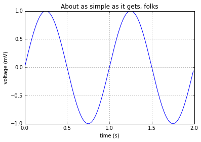
简单绘图
plot 函数:
 1%matplotlib inline
 2
 3import numpy as np
 4import matplotlib.pyplot as plt
 5
 6t = np.arange(0.0, 2.0, 0.01)
 7s = np.sin(2*np.pi*t)
 8plt.plot(t, s)
 9
10plt.xlabel('time (s)')
11plt.ylabel('voltage (mV)')
12plt.title('About as simple as it gets, folks')
13plt.grid(True)
14plt.show()
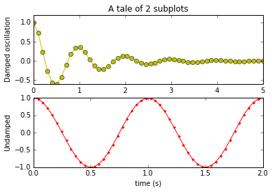
子图
subplot 函数:
 1import numpy as np
 2import matplotlib.mlab as mlab
 3
 4x1 = np.linspace(0.0, 5.0)
 5x2 = np.linspace(0.0, 2.0)
 6
 7y1 = np.cos(2 * np.pi * x1) * np.exp(-x1)
 8y2 = np.cos(2 * np.pi * x2)
 9
10plt.subplot(2, 1, 1)
11plt.plot(x1, y1, 'yo-')
12plt.title('A tale of 2 subplots')
13plt.ylabel('Damped oscillation')
14
15plt.subplot(2, 1, 2)
16plt.plot(x2, y2, 'r.-')
17plt.xlabel('time (s)')
18plt.ylabel('Undamped')
19
20plt.show()
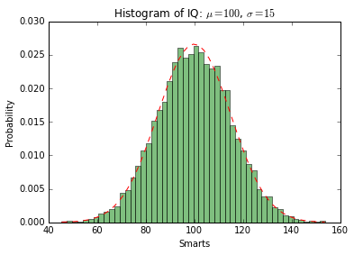
直方图
hist 函数:
 1import numpy as np
 2import matplotlib.mlab as mlab
 3import matplotlib.pyplot as plt
 4
 5# example data
 6mu = 100 # mean of distribution
 7sigma = 15 # standard deviation of distribution
 8x = mu + sigma * np.random.randn(10000)
 9
10num_bins = 50
11# the histogram of the data
12n, bins, patches = plt.hist(x, num_bins, normed=1, facecolor='green', alpha=0.5)
13# add a 'best fit' line
14y = mlab.normpdf(bins, mu, sigma)
15plt.plot(bins, y, 'r--')
16plt.xlabel('Smarts')
17plt.ylabel('Probability')
18plt.title(r'Histogram of IQ: $\mu=100$, $\sigma=15$')
19
20# Tweak spacing to prevent clipping of ylabel
21plt.subplots_adjust(left=0.15)
22plt.show()
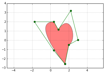
路径图
matplotlib.path 包:
 1import matplotlib.path as mpath
 2import matplotlib.patches as mpatches
 3import matplotlib.pyplot as plt
 4
 5fig, ax = plt.subplots()
 6
 7Path = mpath.Path
 8path_data = [
 9    (Path.MOVETO, (1.58, -2.57)),
10    (Path.CURVE4, (0.35, -1.1)),
11    (Path.CURVE4, (-1.75, 2.0)),
12    (Path.CURVE4, (0.375, 2.0)),
13    (Path.LINETO, (0.85, 1.15)),
14    (Path.CURVE4, (2.2, 3.2)),
15    (Path.CURVE4, (3, 0.05)),
16    (Path.CURVE4, (2.0, -0.5)),
17    (Path.CLOSEPOLY, (1.58, -2.57)),
18    ]
19codes, verts = zip(*path_data)
20path = mpath.Path(verts, codes)
21patch = mpatches.PathPatch(path, facecolor='r', alpha=0.5)
22ax.add_patch(patch)
23
24# plot control points and connecting lines
25x, y = zip(*path.vertices)
26line, = ax.plot(x, y, 'go-')
27
28ax.grid()
29ax.axis('equal')
30plt.show()
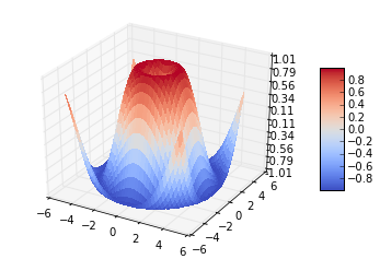
三维绘图
导入 Axex3D:
 1from mpl_toolkits.mplot3d import Axes3D
 2from matplotlib import cm
 3from matplotlib.ticker import LinearLocator, FormatStrFormatter
 4import matplotlib.pyplot as plt
 5import numpy as np
 6
 7fig = plt.figure()
 8ax = fig.gca(projection='3d')
 9X = np.arange(-5, 5, 0.25)
10Y = np.arange(-5, 5, 0.25)
11X, Y = np.meshgrid(X, Y)
12R = np.sqrt(X**2 + Y**2)
13Z = np.sin(R)
14surf = ax.plot_surface(X, Y, Z, rstride=1, cstride=1, cmap=cm.coolwarm,
15        linewidth=0, antialiased=False)
16ax.set_zlim(-1.01, 1.01)
17
18ax.zaxis.set_major_locator(LinearLocator(10))
19ax.zaxis.set_major_formatter(FormatStrFormatter('%.02f'))
20
21fig.colorbar(surf, shrink=0.5, aspect=5)
22
23plt.show()
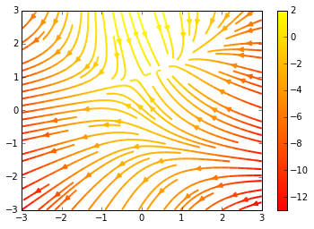
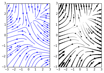
流向图
主要函数:plt.streamplot
 1import numpy as np
 2import matplotlib.pyplot as plt
 3
 4Y, X = np.mgrid[-3:3:100j, -3:3:100j]
 5U = -1 - X**2 + Y
 6V = 1 + X - Y**2
 7speed = np.sqrt(U*U + V*V)
 8
 9plt.streamplot(X, Y, U, V, color=U, linewidth=2, cmap=plt.cm.autumn)
10plt.colorbar()
11
12f, (ax1, ax2) = plt.subplots(ncols=2)
13ax1.streamplot(X, Y, U, V, density=[0.5, 1])
14
15lw = 5*speed/speed.max()
16ax2.streamplot(X, Y, U, V, density=0.6, color='k', linewidth=lw)
17
18plt.show()
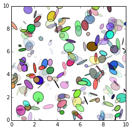
椭圆
Ellipse 对象:
 1from pylab import figure, show, rand
 2from matplotlib.patches import Ellipse
 3
 4NUM = 250
 5
 6ells = [Ellipse(xy=rand(2)*10, width=rand(), height=rand(), angle=rand()*360)
 7        for i in range(NUM)]
 8
 9fig = figure()
10ax = fig.add_subplot(111, aspect='equal')
11for e in ells:
12    ax.add_artist(e)
13    e.set_clip_box(ax.bbox)
14    e.set_alpha(rand())
15    e.set_facecolor(rand(3))
16
17ax.set_xlim(0, 10)
18ax.set_ylim(0, 10)
19
20show()
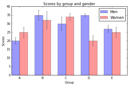
条状图
bar 函数:
 1import numpy as np
 2import matplotlib.pyplot as plt
 3
 4
 5n_groups = 5
 6
 7means_men = (20, 35, 30, 35, 27)
 8std_men = (2, 3, 4, 1, 2)
 9
10means_women = (25, 32, 34, 20, 25)
11std_women = (3, 5, 2, 3, 3)
12
13fig, ax = plt.subplots()
14
15index = np.arange(n_groups)
16bar_width = 0.35
17
18opacity = 0.4
19error_config = {'ecolor': '0.3'}
20
21rects1 = plt.bar(index, means_men, bar_width,
22                 alpha=opacity,
23                 color='b',
24                 yerr=std_men,
25                 error_kw=error_config,
26                 label='Men')
27
28rects2 = plt.bar(index + bar_width, means_women, bar_width,
29                 alpha=opacity,
30                 color='r',
31                 yerr=std_women,
32                 error_kw=error_config,
33                 label='Women')
34
35plt.xlabel('Group')
36plt.ylabel('Scores')
37plt.title('Scores by group and gender')
38plt.xticks(index + bar_width, ('A', 'B', 'C', 'D', 'E'))
39plt.legend()
40
41plt.tight_layout()
42plt.show()
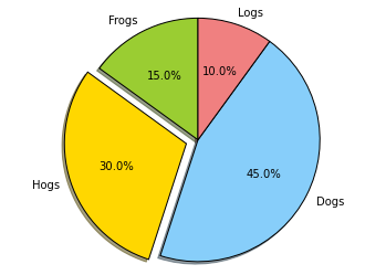
饼状图
pie 函数:
 1import matplotlib.pyplot as plt
 2
 3
 4# The slices will be ordered and plotted counter-clockwise.
 5labels = 'Frogs', 'Hogs', 'Dogs', 'Logs'
 6sizes = [15, 30, 45, 10]
 7colors = ['yellowgreen', 'gold', 'lightskyblue', 'lightcoral']
 8explode = (0, 0.1, 0, 0) # only "explode" the 2nd slice (i.e. 'Hogs')
 9
10plt.pie(sizes, explode=explode, labels=labels, colors=colors,
11        autopct='%1.1f%%', shadow=True, startangle=90)
12# Set aspect ratio to be equal so that pie is drawn as a circle.
13plt.axis('equal')
14
15plt.show()
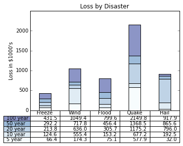
图像中的表格
table 函数:
 1import numpy as np
 2import matplotlib.pyplot as plt
 3
 4
 5data = [[  66386,  174296,   75131,  577908,   32015],
 6        [  58230,  381139,   78045,   99308,  160454],
 7        [  89135,   80552,  152558,  497981,  603535],
 8        [  78415,   81858,  150656,  193263,   69638],
 9        [ 139361,  331509,  343164,  781380,   52269]]
10
11columns = ('Freeze', 'Wind', 'Flood', 'Quake', 'Hail')
12rows = ['%d year' % x for x in (100, 50, 20, 10, 5)]
13
14values = np.arange(0, 2500, 500)
15value_increment = 1000
16
17# Get some pastel shades for the colors
18colors = plt.cm.BuPu(np.linspace(0, 0.5, len(columns)))
19n_rows = len(data)
20
21index = np.arange(len(columns)) + 0.3
22bar_width = 0.4
23
24# Initialize the vertical-offset for the stacked bar chart.
25y_offset = np.array([0.0] * len(columns))
26
27# Plot bars and create text labels for the table
28cell_text = []
29for row in range(n_rows):
30    plt.bar(index, data[row], bar_width, bottom=y_offset, color=colors[row])
31    y_offset = y_offset + data[row]
32    cell_text.append(['%1.1f' % (x/1000.0) for x in y_offset])
33# Reverse colors and text labels to display the last value at the top.
34colors = colors[::-1]
35cell_text.reverse()
36
37# Add a table at the bottom of the axes
38the_table = plt.table(cellText=cell_text,
39                      rowLabels=rows,
40                      rowColours=colors,
41                      colLabels=columns,
42                      loc='bottom')
43
44# Adjust layout to make room for the table:
45plt.subplots_adjust(left=0.2, bottom=0.2)
46
47plt.ylabel("Loss in ${0}'s".format(value_increment))
48plt.yticks(values * value_increment, ['%d' % val for val in values])
49plt.xticks([])
50plt.title('Loss by Disaster')
51
52plt.show()
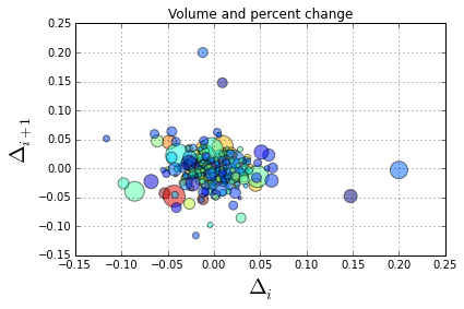
散点图
scatter 函数:
 1import numpy as np
 2import matplotlib.pyplot as plt
 3import matplotlib.cbook as cbook
 4
 5# Load a numpy record array from yahoo csv data with fields date,
 6# open, close, volume, adj_close from the mpl-data/example directory.
 7# The record array stores python datetime.date as an object array in
 8# the date column
 9datafile = cbook.get_sample_data('goog.npy')
10price_data = np.load(datafile).view(np.recarray)
11price_data = price_data[-250:] # get the most recent 250 trading days
12
13delta1 = np.diff(price_data.adj_close)/price_data.adj_close[:-1]
14
15# Marker size in units of points^2
16volume = (15 * price_data.volume[:-2] / price_data.volume[0])**2
17close = 0.003 * price_data.close[:-2] / 0.003 * price_data.open[:-2]
18
19fig, ax = plt.subplots()
20ax.scatter(delta1[:-1], delta1[1:], c=close, s=volume, alpha=0.5)
21
22ax.set_xlabel(r'$\Delta_i$', fontsize=20)
23ax.set_ylabel(r'$\Delta_{i+1}$', fontsize=20)
24ax.set_title('Volume and percent change')
25
26ax.grid(True)
27fig.tight_layout()
28
29plt.show()
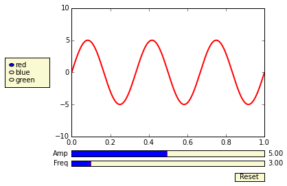
设置按钮
matplotlib.widgets 模块:
 1import numpy as np
 2import matplotlib.pyplot as plt
 3from matplotlib.widgets import Slider, Button, RadioButtons
 4
 5fig, ax = plt.subplots()
 6plt.subplots_adjust(left=0.25, bottom=0.25)
 7t = np.arange(0.0, 1.0, 0.001)
 8a0 = 5
 9f0 = 3
10s = a0*np.sin(2*np.pi*f0*t)
11l, = plt.plot(t,s, lw=2, color='red')
12plt.axis([0, 1, -10, 10])
13
14axcolor = 'lightgoldenrodyellow'
15axfreq = plt.axes([0.25, 0.1, 0.65, 0.03], axisbg=axcolor)
16axamp  = plt.axes([0.25, 0.15, 0.65, 0.03], axisbg=axcolor)
17
18sfreq = Slider(axfreq, 'Freq', 0.1, 30.0, valinit=f0)
19samp = Slider(axamp, 'Amp', 0.1, 10.0, valinit=a0)
20
21def update(val):
22    amp = samp.val
23    freq = sfreq.val
24    l.set_ydata(amp*np.sin(2*np.pi*freq*t))
25    fig.canvas.draw_idle()
26sfreq.on_changed(update)
27samp.on_changed(update)
28
29resetax = plt.axes([0.8, 0.025, 0.1, 0.04])
30button = Button(resetax, 'Reset', color=axcolor, hovercolor='0.975')
31def reset(event):
32    sfreq.reset()
33    samp.reset()
34button.on_clicked(reset)
35
36rax = plt.axes([0.025, 0.5, 0.15, 0.15], axisbg=axcolor)
37radio = RadioButtons(rax, ('red', 'blue', 'green'), active=0)
38def colorfunc(label):
39    l.set_color(label)
40    fig.canvas.draw_idle()
41radio.on_clicked(colorfunc)
42
43plt.show()
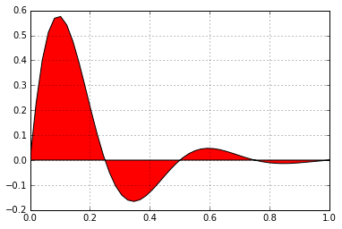
填充曲线
fill 函数:
 1import numpy as np
 2import matplotlib.pyplot as plt
 3
 4
 5x = np.linspace(0, 1)
 6y = np.sin(4 * np.pi * x) * np.exp(-5 * x)
 7
 8plt.fill(x, y, 'r')
 9plt.grid(True)
10plt.show()
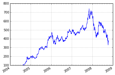
时间刻度
 1"""
 2Show how to make date plots in matplotlib using date tick locators and
 3formatters.  See major_minor_demo1.py for more information on
 4controlling major and minor ticks
 5
 6All matplotlib date plotting is done by converting date instances into
 7days since the 0001-01-01 UTC.  The conversion, tick locating and
 8formatting is done behind the scenes so this is most transparent to
 9you.  The dates module provides several converter functions date2num
10and num2date
11
12"""
13import datetime
14import numpy as np
15import matplotlib.pyplot as plt
16import matplotlib.dates as mdates
17import matplotlib.cbook as cbook
18
19years    = mdates.YearLocator()   # every year
20months   = mdates.MonthLocator()  # every month
21yearsFmt = mdates.DateFormatter('%Y')
22
23# load a numpy record array from yahoo csv data with fields date,
24# open, close, volume, adj_close from the mpl-data/example directory.
25# The record array stores python datetime.date as an object array in
26# the date column
27datafile = cbook.get_sample_data('goog.npy')
28r = np.load(datafile).view(np.recarray)
29
30fig, ax = plt.subplots()
31ax.plot(r.date, r.adj_close)
32
33
34# format the ticks
35ax.xaxis.set_major_locator(years)
36ax.xaxis.set_major_formatter(yearsFmt)
37ax.xaxis.set_minor_locator(months)
38
39datemin = datetime.date(r.date.min().year, 1, 1)
40datemax = datetime.date(r.date.max().year+1, 1, 1)
41ax.set_xlim(datemin, datemax)
42
43# format the coords message box
44def price(x): return '$%1.2f'%x
45ax.format_xdata = mdates.DateFormatter('%Y-%m-%d')
46ax.format_ydata = price
47ax.grid(True)
48
49# rotates and right aligns the x labels, and moves the bottom of the
50# axes up to make room for them
51fig.autofmt_xdate()
52
53plt.show()
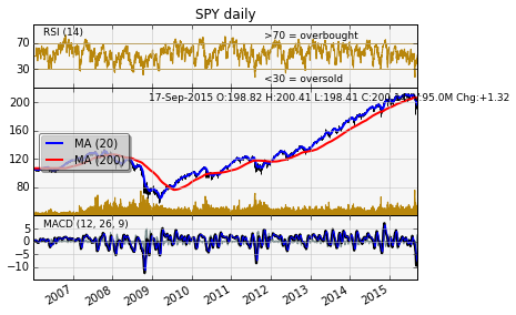
金融数据
  1import datetime
  2import numpy as np
  3import matplotlib.colors as colors
  4import matplotlib.finance as finance
  5import matplotlib.dates as mdates
  6import matplotlib.ticker as mticker
  7import matplotlib.mlab as mlab
  8import matplotlib.pyplot as plt
  9import matplotlib.font_manager as font_manager
 10
 11
 12startdate = datetime.date(2006,1,1)
 13today = enddate = datetime.date.today()
 14ticker = 'SPY'
 15
 16
 17fh = finance.fetch_historical_yahoo(ticker, startdate, enddate)
 18# a numpy record array with fields: date, open, high, low, close, volume, adj_close)
 19
 20r = mlab.csv2rec(fh); fh.close()
 21r.sort()
 22
 23
 24def moving_average(x, n, type='simple'):
 25    """
 26    compute an n period moving average.
 27
 28    type is 'simple' | 'exponential'
 29
 30    """
 31    x = np.asarray(x)
 32    if type=='simple':
 33        weights = np.ones(n)
 34    else:
 35        weights = np.exp(np.linspace(-1., 0., n))
 36
 37    weights /= weights.sum()
 38
 39
 40    a =  np.convolve(x, weights, mode='full')[:len(x)]
 41    a[:n] = a[n]
 42    return a
 43
 44def relative_strength(prices, n=14):
 45    """
 46    compute the n period relative strength indicator
 47    http://stockcharts.com/school/doku.php?id=chart_school:glossary_r#relativestrengthindex
 48    http://www.investopedia.com/terms/r/rsi.asp
 49    """
 50
 51    deltas = np.diff(prices)
 52    seed = deltas[:n+1]
 53    up = seed[seed>=0].sum()/n
 54    down = -seed[seed<0].sum()/n
 55    rs = up/down
 56    rsi = np.zeros_like(prices)
 57    rsi[:n] = 100. - 100./(1.+rs)
 58
 59    for i in range(n, len(prices)):
 60        delta = deltas[i-1] # cause the diff is 1 shorter
 61
 62        if delta>0:
 63            upval = delta
 64            downval = 0.
 65        else:
 66            upval = 0.
 67            downval = -delta
 68
 69        up = (up*(n-1) + upval)/n
 70        down = (down*(n-1) + downval)/n
 71
 72        rs = up/down
 73        rsi[i] = 100. - 100./(1.+rs)
 74
 75    return rsi
 76
 77def moving_average_convergence(x, nslow=26, nfast=12):
 78    """
 79    compute the MACD (Moving Average Convergence/Divergence) using a fast and slow exponential moving avg'
 80    return value is emaslow, emafast, macd which are len(x) arrays
 81    """
 82    emaslow = moving_average(x, nslow, type='exponential')
 83    emafast = moving_average(x, nfast, type='exponential')
 84    return emaslow, emafast, emafast - emaslow
 85
 86
 87plt.rc('axes', grid=True)
 88plt.rc('grid', color='0.75', linestyle='-', linewidth=0.5)
 89
 90textsize = 9
 91left, width = 0.1, 0.8
 92rect1 = [left, 0.7, width, 0.2]
 93rect2 = [left, 0.3, width, 0.4]
 94rect3 = [left, 0.1, width, 0.2]
 95
 96
 97fig = plt.figure(facecolor='white')
 98axescolor  = '#f6f6f6'  # the axes background color
 99
100ax1 = fig.add_axes(rect1, axisbg=axescolor)  #left, bottom, width, height
101ax2 = fig.add_axes(rect2, axisbg=axescolor, sharex=ax1)
102ax2t = ax2.twinx()
103ax3  = fig.add_axes(rect3, axisbg=axescolor, sharex=ax1)
104
105
106
107### plot the relative strength indicator
108prices = r.adj_close
109rsi = relative_strength(prices)
110fillcolor = 'darkgoldenrod'
111
112ax1.plot(r.date, rsi, color=fillcolor)
113ax1.axhline(70, color=fillcolor)
114ax1.axhline(30, color=fillcolor)
115ax1.fill_between(r.date, rsi, 70, where=(rsi>=70), facecolor=fillcolor, edgecolor=fillcolor)
116ax1.fill_between(r.date, rsi, 30, where=(rsi<=30), facecolor=fillcolor, edgecolor=fillcolor)
117ax1.text(0.6, 0.9, '>70 = overbought', va='top', transform=ax1.transAxes, fontsize=textsize)
118ax1.text(0.6, 0.1, '<30 = oversold', transform=ax1.transAxes, fontsize=textsize)
119ax1.set_ylim(0, 100)
120ax1.set_yticks([30,70])
121ax1.text(0.025, 0.95, 'RSI (14)', va='top', transform=ax1.transAxes, fontsize=textsize)
122ax1.set_title('%s daily'%ticker)
123
124### plot the price and volume data
125dx = r.adj_close - r.close
126low = r.low + dx
127high = r.high + dx
128
129deltas = np.zeros_like(prices)
130deltas[1:] = np.diff(prices)
131up = deltas>0
132ax2.vlines(r.date[up], low[up], high[up], color='black', label='_nolegend_')
133ax2.vlines(r.date[~up], low[~up], high[~up], color='black', label='_nolegend_')
134ma20 = moving_average(prices, 20, type='simple')
135ma200 = moving_average(prices, 200, type='simple')
136
137linema20, = ax2.plot(r.date, ma20, color='blue', lw=2, label='MA (20)')
138linema200, = ax2.plot(r.date, ma200, color='red', lw=2, label='MA (200)')
139
140
141last = r[-1]
142s = '%s O:%1.2f H:%1.2f L:%1.2f C:%1.2f, V:%1.1fM Chg:%+1.2f' % (
143    today.strftime('%d-%b-%Y'),
144    last.open, last.high,
145    last.low, last.close,
146    last.volume*1e-6,
147    last.close-last.open )
148t4 = ax2.text(0.3, 0.9, s, transform=ax2.transAxes, fontsize=textsize)
149
150props = font_manager.FontProperties(size=10)
151leg = ax2.legend(loc='center left', shadow=True, fancybox=True, prop=props)
152leg.get_frame().set_alpha(0.5)
153
154
155volume = (r.close*r.volume)/1e6  # dollar volume in millions
156vmax = volume.max()
157poly = ax2t.fill_between(r.date, volume, 0, label='Volume', facecolor=fillcolor, edgecolor=fillcolor)
158ax2t.set_ylim(0, 5*vmax)
159ax2t.set_yticks([])
160
161
162### compute the MACD indicator
163fillcolor = 'darkslategrey'
164nslow = 26
165nfast = 12
166nema = 9
167emaslow, emafast, macd = moving_average_convergence(prices, nslow=nslow, nfast=nfast)
168ema9 = moving_average(macd, nema, type='exponential')
169ax3.plot(r.date, macd, color='black', lw=2)
170ax3.plot(r.date, ema9, color='blue', lw=1)
171ax3.fill_between(r.date, macd-ema9, 0, alpha=0.5, facecolor=fillcolor, edgecolor=fillcolor)
172
173
174ax3.text(0.025, 0.95, 'MACD (%d, %d, %d)'%(nfast, nslow, nema), va='top',
175         transform=ax3.transAxes, fontsize=textsize)
176
177#ax3.set_yticks([])
178# turn off upper axis tick labels, rotate the lower ones, etc
179for ax in ax1, ax2, ax2t, ax3:
180    if ax!=ax3:
181        for label in ax.get_xticklabels():
182            label.set_visible(False)
183    else:
184        for label in ax.get_xticklabels():
185            label.set_rotation(30)
186            label.set_horizontalalignment('right')
187
188    ax.fmt_xdata = mdates.DateFormatter('%Y-%m-%d')
189
190
191
192class MyLocator(mticker.MaxNLocator):
193    def __init__(self, *args, **kwargs):
194        mticker.MaxNLocator.__init__(self, *args, **kwargs)
195
196    def __call__(self, *args, **kwargs):
197        return mticker.MaxNLocator.__call__(self, *args, **kwargs)
198
199# at most 5 ticks, pruning the upper and lower so they don't overlap
200# with other ticks
201#ax2.yaxis.set_major_locator(mticker.MaxNLocator(5, prune='both'))
202#ax3.yaxis.set_major_locator(mticker.MaxNLocator(5, prune='both'))
203
204ax2.yaxis.set_major_locator(MyLocator(5, prune='both'))
205ax3.yaxis.set_major_locator(MyLocator(5, prune='both'))
206
207plt.show()
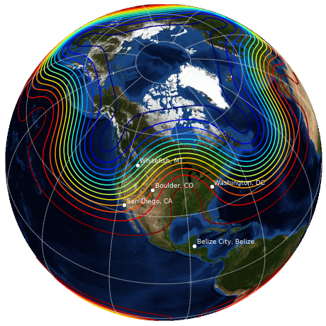
basemap 画地图
需要安装 basemap 包:
 1import matplotlib.pyplot as plt
 2import numpy as np
 3
 4try:
 5    from mpl_toolkits.basemap import Basemap
 6    have_basemap = True
 7except ImportError:
 8    have_basemap = False
 9
10
11def plotmap():
12    # create figure
13    fig = plt.figure(figsize=(8,8))
14    # set up orthographic map projection with
15    # perspective of satellite looking down at 50N, 100W.
16    # use low resolution coastlines.
17    map = Basemap(projection='ortho',lat_0=50,lon_0=-100,resolution='l')
18    # lat/lon coordinates of five cities.
19    lats=[40.02,32.73,38.55,48.25,17.29]
20    lons=[-105.16,-117.16,-77.00,-114.21,-88.10]
21    cities=['Boulder, CO','San Diego, CA',
22            'Washington, DC','Whitefish, MT','Belize City, Belize']
23    # compute the native map projection coordinates for cities.
24    xc,yc = map(lons,lats)
25    # make up some data on a regular lat/lon grid.
26    nlats = 73; nlons = 145; delta = 2.*np.pi/(nlons-1)
27    lats = (0.5*np.pi-delta*np.indices((nlats,nlons))[0,:,:])
28    lons = (delta*np.indices((nlats,nlons))[1,:,:])
29    wave = 0.75*(np.sin(2.*lats)**8*np.cos(4.*lons))
30    mean = 0.5*np.cos(2.*lats)*((np.sin(2.*lats))**2 + 2.)
31    # compute native map projection coordinates of lat/lon grid.
32    # (convert lons and lats to degrees first)
33    x, y = map(lons*180./np.pi, lats*180./np.pi)
34    # draw map boundary
35    map.drawmapboundary(color="0.9")
36    # draw graticule (latitude and longitude grid lines)
37    map.drawmeridians(np.arange(0,360,30),color="0.9")
38    map.drawparallels(np.arange(-90,90,30),color="0.9")
39    # plot filled circles at the locations of the cities.
40    map.plot(xc,yc,'wo')
41    # plot the names of five cities.
42    for name,xpt,ypt in zip(cities,xc,yc):
43        plt.text(xpt+100000,ypt+100000,name,fontsize=9,color='w')
44    # contour data over the map.
45    cs = map.contour(x,y,wave+mean,15,linewidths=1.5)
46    # draw blue marble image in background.
47    # (downsample the image by 50% for speed)
48    map.bluemarble(scale=0.5)
49
50def plotempty():
51    # create figure
52    fig = plt.figure(figsize=(8,8))
53    fig.text(0.5, 0.5, "Sorry, could not import Basemap",
54                                horizontalalignment='center')
55
56if have_basemap:
57    plotmap()
58else:
59    plotempty()
60plt.show()
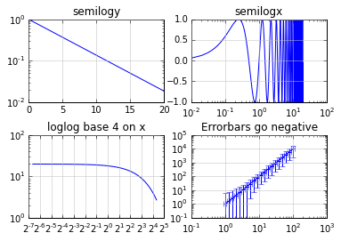
对数图
loglog, semilogx, semilogy, errorbar 函数:
 1import numpy as np
 2import matplotlib.pyplot as plt
 3
 4plt.subplots_adjust(hspace=0.4)
 5t = np.arange(0.01, 20.0, 0.01)
 6
 7# log y axis
 8plt.subplot(221)
 9plt.semilogy(t, np.exp(-t/5.0))
10plt.title('semilogy')
11plt.grid(True)
12
13# log x axis
14plt.subplot(222)
15plt.semilogx(t, np.sin(2*np.pi*t))
16plt.title('semilogx')
17plt.grid(True)
18
19# log x and y axis
20plt.subplot(223)
21plt.loglog(t, 20*np.exp(-t/10.0), basex=2)
22plt.grid(True)
23plt.title('loglog base 4 on x')
24
25# with errorbars: clip non-positive values
26ax = plt.subplot(224)
27ax.set_xscale("log", nonposx='clip')
28ax.set_yscale("log", nonposy='clip')
29
30x = 10.0**np.linspace(0.0, 2.0, 20)
31y = x**2.0
32plt.errorbar(x, y, xerr=0.1*x, yerr=5.0+0.75*y)
33ax.set_ylim(ymin=0.1)
34ax.set_title('Errorbars go negative')
35
36
37plt.show()
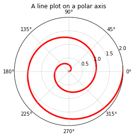
极坐标
设置 polar=True:
 1import numpy as np
 2import matplotlib.pyplot as plt
 3
 4
 5r = np.arange(0, 3.0, 0.01)
 6theta = 2 * np.pi * r
 7
 8ax = plt.subplot(111, polar=True)
 9ax.plot(theta, r, color='r', linewidth=3)
10ax.set_rmax(2.0)
11ax.grid(True)
12
13ax.set_title("A line plot on a polar axis", va='bottom')
14plt.show()
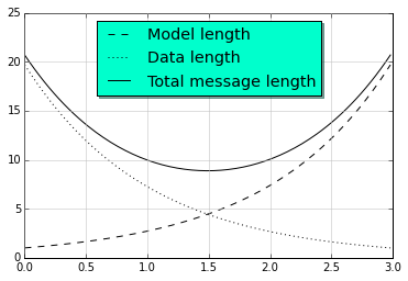
标注
legend 函数:
 1import numpy as np
 2import matplotlib.pyplot as plt
 3
 4# Make some fake data.
 5a = b = np.arange(0,3, .02)
 6c = np.exp(a)
 7d = c[::-1]
 8
 9# Create plots with pre-defined labels.
10plt.plot(a, c, 'k--', label='Model length')
11plt.plot(a, d, 'k:', label='Data length')
12plt.plot(a, c+d, 'k', label='Total message length')
13
14legend = plt.legend(loc='upper center', shadow=True, fontsize='x-large')
15
16# Put a nicer background color on the legend.
17legend.get_frame().set_facecolor('#00FFCC')
18
19plt.show()
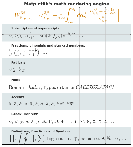
数学公式
  1from __future__ import print_function
  2import matplotlib.pyplot as plt
  3import os
  4import sys
  5import re
  6import gc
  7
  8# Selection of features following "Writing mathematical expressions" tutorial
  9mathtext_titles = {
 10    0: "Header demo",
 11    1: "Subscripts and superscripts",
 12    2: "Fractions, binomials and stacked numbers",
 13    3: "Radicals",
 14    4: "Fonts",
 15    5: "Accents",
 16    6: "Greek, Hebrew",
 17    7: "Delimiters, functions and Symbols"}
 18n_lines = len(mathtext_titles)
 19
 20# Randomly picked examples
 21mathext_demos = {
 22    0: r"$W^{3\beta}_{\delta_1 \rho_1 \sigma_2} = "
 23    r"U^{3\beta}_{\delta_1 \rho_1} + \frac{1}{8 \pi 2} "
 24    r"\int^{\alpha_2}_{\alpha_2} d \alpha^\prime_2 \left[\frac{ "
 25    r"U^{2\beta}_{\delta_1 \rho_1} - \alpha^\prime_2U^{1\beta}_"
 26    r"{\rho_1 \sigma_2} }{U^{0\beta}_{\rho_1 \sigma_2}}\right]$",
 27
 28    1: r"$\alpha_i > \beta_i,\ "
 29    r"\alpha_{i+1}^j = {\rm sin}(2\pi f_j t_i) e^{-5 t_i/\tau},\ "
 30    r"\ldots$",
 31
 32    2: r"$\frac{3}{4},\ \binom{3}{4},\ \stackrel{3}{4},\ "
 33    r"\left(\frac{5 - \frac{1}{x}}{4}\right),\ \ldots$",
 34
 35    3: r"$\sqrt{2},\ \sqrt[3]{x},\ \ldots$",
 36
 37    4: r"$\mathrm{Roman}\ , \ \mathit{Italic}\ , \ \mathtt{Typewriter} \ "
 38    r"\mathrm{or}\ \mathcal{CALLIGRAPHY}$",
 39
 40    5: r"$\acute a,\ \bar a,\ \breve a,\ \dot a,\ \ddot a, \ \grave a, \ "
 41    r"\hat a,\ \tilde a,\ \vec a,\ \widehat{xyz},\ \widetilde{xyz},\ "
 42    r"\ldots$",
 43
 44    6: r"$\alpha,\ \beta,\ \chi,\ \delta,\ \lambda,\ \mu,\ "
 45    r"\Delta,\ \Gamma,\ \Omega,\ \Phi,\ \Pi,\ \Upsilon,\ \nabla,\ "
 46    r"\aleph,\ \beth,\ \daleth,\ \gimel,\ \ldots$",
 47
 48    7: r"$\coprod,\ \int,\ \oint,\ \prod,\ \sum,\ "
 49    r"\log,\ \sin,\ \approx,\ \oplus,\ \star,\ \varpropto,\ "
 50    r"\infty,\ \partial,\ \Re,\ \leftrightsquigarrow, \ \ldots$"}
 51
 52
 53def doall():
 54    # Colors used in mpl online documentation.
 55    mpl_blue_rvb = (191./255., 209./256., 212./255.)
 56    mpl_orange_rvb = (202/255., 121/256., 0./255.)
 57    mpl_grey_rvb = (51./255., 51./255., 51./255.)
 58
 59    # Creating figure and axis.
 60    plt.figure(figsize=(6, 7))
 61    plt.axes([0.01, 0.01, 0.98, 0.90], axisbg="white", frameon=True)
 62    plt.gca().set_xlim(0., 1.)
 63    plt.gca().set_ylim(0., 1.)
 64    plt.gca().set_title("Matplotlib's math rendering engine",
 65                        color=mpl_grey_rvb, fontsize=14, weight='bold')
 66    plt.gca().set_xticklabels("", visible=False)
 67    plt.gca().set_yticklabels("", visible=False)
 68
 69    # Gap between lines in axes coords
 70    line_axesfrac = (1. / (n_lines))
 71
 72    # Plotting header demonstration formula
 73    full_demo = mathext_demos[0]
 74    plt.annotate(full_demo,
 75                 xy=(0.5, 1. - 0.59*line_axesfrac),
 76                 xycoords='data', color=mpl_orange_rvb, ha='center',
 77                 fontsize=20)
 78
 79    # Plotting features demonstration formulae
 80    for i_line in range(1, n_lines):
 81        baseline = 1. - (i_line)*line_axesfrac
 82        baseline_next = baseline - line_axesfrac*1.
 83        title = mathtext_titles[i_line] + ":"
 84        fill_color = ['white', mpl_blue_rvb][i_line % 2]
 85        plt.fill_between([0., 1.], [baseline, baseline],
 86                         [baseline_next, baseline_next],
 87                         color=fill_color, alpha=0.5)
 88        plt.annotate(title,
 89                     xy=(0.07, baseline - 0.3*line_axesfrac),
 90                     xycoords='data', color=mpl_grey_rvb, weight='bold')
 91        demo = mathext_demos[i_line]
 92        plt.annotate(demo,
 93                     xy=(0.05, baseline - 0.75*line_axesfrac),
 94                     xycoords='data', color=mpl_grey_rvb,
 95                     fontsize=16)
 96
 97    for i in range(n_lines):
 98        s = mathext_demos[i]
 99        print(i, s)
100    plt.show()
101
102if '--latex' in sys.argv:
103    # Run: python mathtext_examples.py --latex
104    # Need amsmath and amssymb packages.
105    fd = open("mathtext_examples.ltx", "w")
106    fd.write("\\documentclass{article}\n")
107    fd.write("\\usepackage{amsmath, amssymb}\n")
108    fd.write("\\begin{document}\n")
109    fd.write("\\begin{enumerate}\n")
110
111    for i in range(n_lines):
112        s = mathext_demos[i]
113        s = re.sub(r"(?<!\\)\$", "$$", s)
114        fd.write("\\item %s\n" % s)
115
116    fd.write("\\end{enumerate}\n")
117    fd.write("\\end{document}\n")
118    fd.close()
119
120    os.system("pdflatex mathtext_examples.ltx")
121else:
122    doall()
0 $W^{3\beta}_{\delta_1 \rho_1 \sigma_2} = U^{3\beta}_{\delta_1 \rho_1} + \frac{1}{8 \pi 2} \int^{\alpha_2}_{\alpha_2} d \alpha^\prime_2 \left[\frac{ U^{2\beta}_{\delta_1 \rho_1} - \alpha^\prime_2U^{1\beta}_{\rho_1 \sigma_2} }{U^{0\beta}_{\rho_1 \sigma_2}}\right]$
1 $\alpha_i > \beta_i,\ \alpha_{i+1}^j = {\rm sin}(2\pi f_j t_i) e^{-5 t_i/\tau},\ \ldots$
2 $\frac{3}{4},\ \binom{3}{4},\ \stackrel{3}{4},\ \left(\frac{5 - \frac{1}{x}}{4}\right),\ \ldots$
3 $\sqrt{2},\ \sqrt[3]{x},\ \ldots$
4 $\mathrm{Roman}\ , \ \mathit{Italic}\ , \ \mathtt{Typewriter} \ \mathrm{or}\ \mathcal{CALLIGRAPHY}$
5 $\acute a,\ \bar a,\ \breve a,\ \dot a,\ \ddot a, \ \grave a, \ \hat a,\ \tilde a,\ \vec a,\ \widehat{xyz},\ \widetilde{xyz},\ \ldots$
6 $\alpha,\ \beta,\ \chi,\ \delta,\ \lambda,\ \mu,\ \Delta,\ \Gamma,\ \Omega,\ \Phi,\ \Pi,\ \Upsilon,\ \nabla,\ \aleph,\ \beth,\ \daleth,\ \gimel,\ \ldots$
7 $\coprod,\ \int,\ \oint,\ \prod,\ \sum,\ \log,\ \sin,\ \approx,\ \oplus,\ \star,\ \varpropto,\ \infty,\ \partial,\ \Re,\ \leftrightsquigarrow, \ \ldots$