03.02 Matplotlib 基础
Matplotlib 基础
在使用Numpy之前,需要了解一些画图的基础。
Matplotlib是一个类似Matlab的工具包,主页地址为
导入 matplotlib 和 numpy:
1%pylab
Using matplotlib backend: Qt4Agg
Populating the interactive namespace from numpy and matplotlib
plot 二维图
1plot(y)
2plot(x, y)
3plot(x, y, format_string)
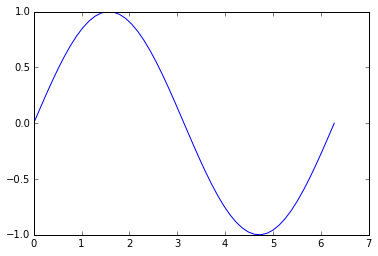
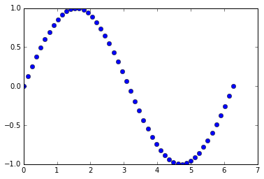
只给定 y 值,默认以下标为 x 轴:
1%matplotlib inline
2x = linspace(0, 2 * pi, 50)
3plot(sin(x))
[<matplotlib.lines.Line2D at 0xa086fd0>]

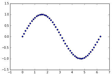
给定 x 和 y 值:
1plot(x, sin(x))
[<matplotlib.lines.Line2D at 0xa241898>]
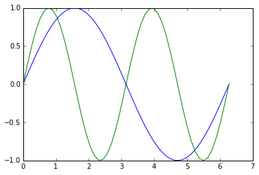
多条数据线:
1plot(x, sin(x),
2    x, sin(2 * x))
[<matplotlib.lines.Line2D at 0xa508b00>,
 <matplotlib.lines.Line2D at 0xa508d30>]
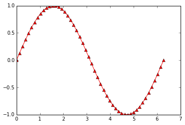
使用字符串,给定线条参数:
1plot(x, sin(x), 'r-^')
[<matplotlib.lines.Line2D at 0xba6ea20>]
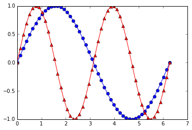
多线条:
1plot(x, sin(x), 'b-o',
2    x, sin(2 * x), 'r-^')
[<matplotlib.lines.Line2D at 0xbcf1710>,
 <matplotlib.lines.Line2D at 0xbcf1940>]
更多参数设置,请查阅帮助。事实上,字符串使用的格式与Matlab相同。
scatter 散点图
1scatter(x, y)
2scatter(x, y, size)
3scatter(x, y, size, color)
假设我们想画二维散点图:
1plot(x, sin(x), 'bo')
[<matplotlib.lines.Line2D at 0xbd6c0b8>]
可以使用 scatter 达到同样的效果:
1scatter(x, sin(x))
<matplotlib.collections.PathCollection at 0xbd996d8>
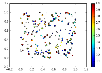
事实上,scatter函数与Matlab的用法相同,还可以指定它的大小,颜色等参数:
1x = rand(200)
2y = rand(200)
3size = rand(200) * 30
4color = rand(200)
5scatter(x, y, size, color)
6# 显示颜色条
7colorbar()
<matplotlib.colorbar.Colorbar instance at 0x000000000C31F448>
多图
使用figure()命令产生新的图像:
1t = linspace(0, 2*pi, 50)
2x = sin(t)
3y = cos(t)
4figure()
5plot(x)
6figure()
7plot(y)
[<matplotlib.lines.Line2D at 0xc680cf8>]

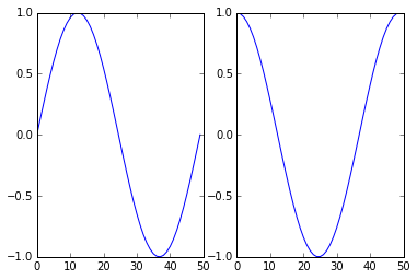
或者使用 subplot 在一幅图中画多幅子图:
subplot(row, column, index)
1subplot(1, 2, 1)
2plot(x)
3subplot(1, 2, 2)
4plot(y)
[<matplotlib.lines.Line2D at 0xcd47518>]
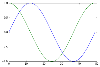
向图中添加数据
默认多次 plot 会叠加:
1plot(x)
2plot(y)
[<matplotlib.lines.Line2D at 0xcbcfd30>]
可以跟Matlab类似用 hold(False)关掉,这样新图会将原图覆盖:
1plot(x)
2hold(False)
3plot(y)
4# 恢复原来设定
5hold(True)
[<matplotlib.lines.Line2D at 0xcf4b9b0>]
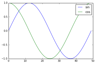
标签
可以在 plot 中加入 label ,使用 legend 加上图例:
1plot(x, label='sin')
2plot(y, label='cos')
3legend()
<matplotlib.legend.Legend at 0xd2089b0>
或者直接在 legend中加入:
1plot(x)
2plot(y)
3legend(['sin', 'cos'])
<matplotlib.legend.Legend at 0xd51fb00>

坐标轴,标题,网格
可以设置坐标轴的标签和标题:
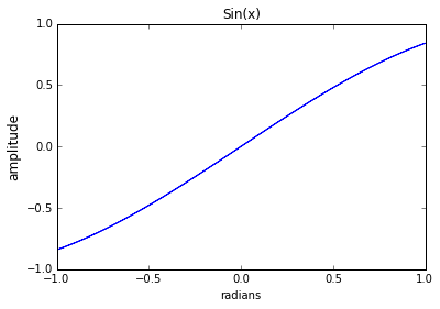
1plot(x, sin(x))
2xlabel('radians')
3# 可以设置字体大小
4ylabel('amplitude', fontsize='large')
5title('Sin(x)')
<matplotlib.text.Text at 0xd727dd8>
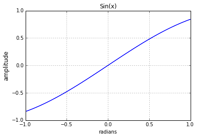
用 'grid()' 来显示网格:
1plot(x, sin(x))
2xlabel('radians')
3ylabel('amplitude', fontsize='large')
4title('Sin(x)')
5grid()
清除、关闭图像
清除已有的图像使用:
clf()
关闭当前图像:
close()
关闭所有图像:
close('all')
imshow 显示图片
灰度图片可以看成二维数组:
1# 导入lena图片
2from scipy.misc import lena
3img = lena()
4img
array([[162, 162, 162, ..., 170, 155, 128],
       [162, 162, 162, ..., 170, 155, 128],
       [162, 162, 162, ..., 170, 155, 128],
       ...,
       [ 43,  43,  50, ..., 104, 100,  98],
       [ 44,  44,  55, ..., 104, 105, 108],
       [ 44,  44,  55, ..., 104, 105, 108]])
我们可以用 imshow() 来显示图片数据:
1imshow(img,
2       # 设置坐标范围
3      extent = [-25, 25, -25, 25],
4       # 设置colormap
5      cmap = cm.bone)
6colorbar()
<matplotlib.colorbar.Colorbar instance at 0x000000000DECFD88>
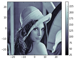
更多参数和用法可以参阅帮助。
这里 cm 表示 colormap,可以看它的种类:
1dir(cm)
[u'Accent',
 u'Accent_r',
 u'Blues',
 u'Blues_r',
 u'BrBG',
 u'BrBG_r',
 u'BuGn',
 u'BuGn_r',
 u'BuPu',
 u'BuPu_r',
 u'CMRmap',
 u'CMRmap_r',
 u'Dark2',
 u'Dark2_r',
 u'GnBu',
 u'GnBu_r',
 u'Greens',
 u'Greens_r',
 u'Greys',
 u'Greys_r',
 'LUTSIZE',
 u'OrRd',
 u'OrRd_r',
 u'Oranges',
 u'Oranges_r',
 u'PRGn',
 u'PRGn_r',
 u'Paired',
 u'Paired_r',
 u'Pastel1',
 u'Pastel1_r',
 u'Pastel2',
 u'Pastel2_r',
 u'PiYG',
 u'PiYG_r',
 u'PuBu',
 u'PuBuGn',
 u'PuBuGn_r',
 u'PuBu_r',
 u'PuOr',
 u'PuOr_r',
 u'PuRd',
 u'PuRd_r',
 u'Purples',
 u'Purples_r',
 u'RdBu',
 u'RdBu_r',
 u'RdGy',
 u'RdGy_r',
 u'RdPu',
 u'RdPu_r',
 u'RdYlBu',
 u'RdYlBu_r',
 u'RdYlGn',
 u'RdYlGn_r',
 u'Reds',
 u'Reds_r',
 'ScalarMappable',
 u'Set1',
 u'Set1_r',
 u'Set2',
 u'Set2_r',
 u'Set3',
 u'Set3_r',
 u'Spectral',
 u'Spectral_r',
 u'Wistia',
 u'Wistia_r',
 u'YlGn',
 u'YlGnBu',
 u'YlGnBu_r',
 u'YlGn_r',
 u'YlOrBr',
 u'YlOrBr_r',
 u'YlOrRd',
 u'YlOrRd_r',
 '__builtins__',
 '__doc__',
 '__file__',
 '__name__',
 '__package__',
 '_generate_cmap',
 '_reverse_cmap_spec',
 '_reverser',
 'absolute_import',
 u'afmhot',
 u'afmhot_r',
 u'autumn',
 u'autumn_r',
 u'binary',
 u'binary_r',
 u'bone',
 u'bone_r',
 u'brg',
 u'brg_r',
 u'bwr',
 u'bwr_r',
 'cbook',
 'cmap_d',
 'cmapname',
 'colors',
 u'cool',
 u'cool_r',
 u'coolwarm',
 u'coolwarm_r',
 u'copper',
 u'copper_r',
 'cubehelix',
 u'cubehelix_r',
 'datad',
 'division',
 u'flag',
 u'flag_r',
 'get_cmap',
 u'gist_earth',
 u'gist_earth_r',
 u'gist_gray',
 u'gist_gray_r',
 u'gist_heat',
 u'gist_heat_r',
 u'gist_ncar',
 u'gist_ncar_r',
 u'gist_rainbow',
 u'gist_rainbow_r',
 u'gist_stern',
 u'gist_stern_r',
 u'gist_yarg',
 u'gist_yarg_r',
 u'gnuplot',
 u'gnuplot2',
 u'gnuplot2_r',
 u'gnuplot_r',
 u'gray',
 u'gray_r',
 u'hot',
 u'hot_r',
 u'hsv',
 u'hsv_r',
 u'jet',
 u'jet_r',
 'ma',
 'mpl',
 u'nipy_spectral',
 u'nipy_spectral_r',
 'np',
 u'ocean',
 u'ocean_r',
 'os',
 u'pink',
 u'pink_r',
 'print_function',
 u'prism',
 u'prism_r',
 u'rainbow',
 u'rainbow_r',
 'register_cmap',
 'revcmap',
 u'seismic',
 u'seismic_r',
 'six',
 'spec',
 'spec_reversed',
 u'spectral',
 u'spectral_r',
 u'spring',
 u'spring_r',
 u'summer',
 u'summer_r',
 u'terrain',
 u'terrain_r',
 'unicode_literals',
 u'winter',
 u'winter_r']
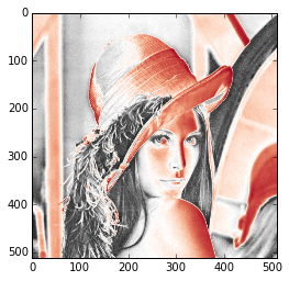
使用不同的 colormap 会有不同的显示效果。
1imshow(img, cmap=cm.RdGy_r)
<matplotlib.image.AxesImage at 0xe0883c8>
从脚本中运行
在脚本中使用 plot 时,通常图像是不会直接显示的,需要增加 show() 选项,只有在遇到 show() 命令之后,图像才会显示。
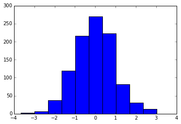
直方图
从高斯分布随机生成1000个点得到的直方图:
1hist(randn(1000))
(array([   2.,    7.,   37.,  119.,  216.,  270.,  223.,   82.,   31.,   13.]),
 array([-3.65594649, -2.98847032, -2.32099415, -1.65351798, -0.98604181,
        -0.31856564,  0.34891053,  1.0163867 ,  1.68386287,  2.35133904,
         3.01881521]),
 <a list of 10 Patch objects>)
更多例子请参考下列网站: